Introduction & BackgroundThis is a report on my re-design and testing of my Kodak Easyshare V610 Digital Camera using a User Centered Design Approach. The reason I am re-designing the camera is for my Design for Interactive Media module titled “User Centered Design.”
An evaluation of the Kodak Easyshare V610 Digital Camera was completed for an assignment for the course’s previous module titled “Design for Interaction”. This can be viewed by clicking on the link below
http://kirstiesdfim.blogspot.com/2006/10/brief-2-design-for-interaction.htmlStage 1 - Re-design of the product and building a prototype
Stage 2 - Evaluation of the re-designed prototype
Methodologies
For stage 1
I followed Preece et al (2002) interaction design model and Mayhew’s(1992) General Principles of User Interface Design in the re-design.

For Stage 2
I used Neilson’s (1993)Discount Usability Evaluation
Stage 1
Identifying needs and establishing requirements A usability study of the camera before re-design consisted of direct observation of the user carrying out the task of sending a photo via Bluetooth to another mobile device with a security code. The users would want to use a security code if the transfer took place in public. I also compiled a short questionairre for the volunteers to complete after the testI tested the camera's usability on 4 volunteers. The Kodak Easyshare V610 would be used by both amateur (novice) users and semi-skilled photographers (intermediate) it is unlikely to be used by an proffessional photographer (expert) as a proffessional would have much more sophisticated equipment. It would be used indirectly by someone taking a photo for the cameras owner or directly by the owner themselves. The camera may be used infrequently or frequently. It's users could come from all age groups with no, limited or lots of prior technical knowledge and they may or may not have used a digital camera. A typical user would be someone who has a family or enjoys socialising and have purchased the camera bringing with them little or no knowledge of digital cameras to record their memories. I tried to get testers who were from different ranges of the demographics who would be llikely users of the camera.
Tester 1
Age: 10
Sex: Male
Owner of digital camera : No
Prior technical knowledge: little
Tester 2
Age:34
Sex:Female
Owner of digital camera:Yes
Prior Technical knowledge: Limited
Tester 3
Age: 23
Sex: Female
Owner of digital camera : Yes
Prior technical knowledge: little
Tester 4
Age: 22
Sex: Male
Owner of digital camera : Yes
Prior technical knowledge: Lots
Findings
3 out of the 4 testers did not manage to complete the task set.
All four said they probably wouldn't remember where to find the Bluetooth security options a second time.
Only one tester thought the task was easy to carry out
3 out of the 4 testers did not manage to find the Bluetooth set-up menu which contains the option of setting a security code .
All four testers commented that the lack of any meaningful grip on the back of the camera means it doesn't feel that safe when shooting, nor is it easy to keep stable when using the long end of the zoom. I only felt safe when the strap was firmly wrapped around my wrist All Four testers found the buttons too small
Re-Design
I am not going to re-design the whole camera as it would make a very large assignment so i'm just going to re-design the problems highlighted by the usability test, by my previous module's "Design for Interaction" assignment and by my own observations. Also those brought to light by the direct observation and those highlighted in the questionnaire (Appendix 1) and user interviews.
Mayhew’s(1992) General Principles of User Interface Design.
I took Mayhew‘s (1992) General Principles of User Interface Design into consideration in my re-designing of the camera
Simplicity
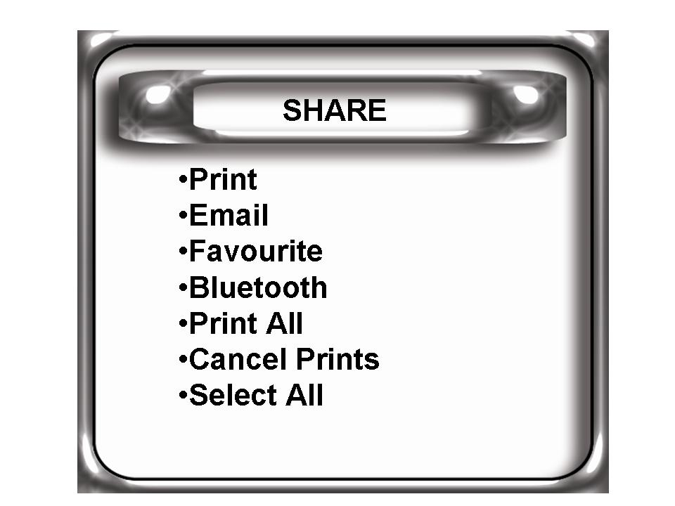
The main problem in the menu structure that was crying out for redesign is the security options for Bluetooth. At present to complete the task of sending a photo to another device (in this case my mobile phone) using Bluetooth with a security code you need to firstly access the set-up through the menu button and then go to the Share Menu to send the picture.
The image below shows the hierarchy of the two menus required for completion of the Bluetooth task "http://photos1.blogger.com/blogger2/5851/4281/400/heir.jpg"
Ease of learning
There is now only one menu that needs to be accessed to complete the task. This makes the task easy to learn and the user will be much more likely to remember the steps required to complete the task in the future.
Ease of use
From my usability study and my own observations I have decided to re-design the controls on the rear of the camera to make them more accessible and to ensure they were not pressed accidently when pointing and shooting. Also i have added grips to each side of the rear of the camera
Prototyping
This is the original design and the re-designed prototype of the camera

Stage 2
Testing
I tested my prototypes on the same volunteers I used in my usibility study. I again used a direct approach in observing the testers. They completed the same questionairre as before and I held interviews afterwards.
All users found the new lay-out of the buttons easier to manipulate and said the camera felt steadier whilst holding it.
Neilson’s (1993) - D.U.E (Discount Usability Evaluation)
Using the guide below i evaluated the re-design against Neilson's (1993) Heuristics
1 = cosmetic issue
2 = minor problem
3 = major problem
4 = catastrophe
Use simple & natural dialogue Score 0
The interface uses simple and natural dialogue
Speak the users’ language - Score 0
The interface speaks the users’ language
Minimise memory load - Score 0
This new design minimises memory load
Provide consistency - Score 0 -
The menu is consistent
Provide good feedback - Score 3
There is no feedback on the Bluetooth menu
Provide clearly marked exits - Score 3
There is not clearly marked exits on every level of the Share menu
Provide appropriate shortcuts - Score 3
There are no shortcuts on the Share / Bluetooth menu
Provide good error messages - Score 0
Good error messages are provided
Prevent errors if possible - Score 3
Provide a good help facility - Score 3
No help facility provided
Conclusions / Recommendations
From my Heuristic Evaluation I can conclude that there is still re-designing that could be done on this cameras Bluetooth feature. I would recommend that the following factors be considered whilst planning a further re-design
Providing good feedback
Providing clearly marked exits and appropriate shortcuts on the Share / Bluetooth menu
Error prevention
Providing a good help facility
There has been no indication that the external rear controls need to be re-designed at present as all 4 testers were happy with the design.
References
Preece et al., 2002. Interaction Design. John Wiley & Sons Inc.
Nielsen, J., 1993. Usability Engineering.
Norman, D., 2001. The Design of Everyday Things. MIT Press
Appendices
Appendix 1 - Questionnaire
Task: Send a photo via Bluetooth to my mobile phone using a security Passcode.
Please circle your answer
1. Did you complete the task set? Yes / No
2. Do you think you’d remember the actions needed to complete the task a second time? Yes / No
3. Did you find the task easy? Yes / No
4. How easy was it to find the security set-up menu?
Easy / Moderate / Hard
5. Did you find the camera* comfortable to hold? Yes / No
6. Did you accidently press any buttons when you didn’t mean to? Yes/No 7. Did you find the buttons easy to use? Yes / No


